


Red and Orange for Equal Populations
The population method in the United States is fascinating. People often gravitate toward the east and west coasts and cram themselves into small areas with high populations. In this photo, you can see those small orange slivers are equal to the population marked in red.
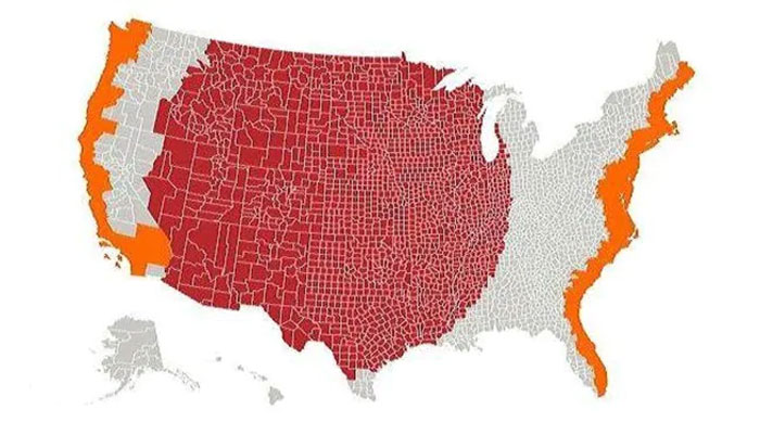
Red And Orange For Equal Populations
Australia vs. the US
In the US, you don’t usually think about other countries unless you’re planning a vacation. Who ponders the size of Australia? This map superimposes the United States over Australia to show how big it is. They’re pretty similar in size!
ADVERTISEMENT
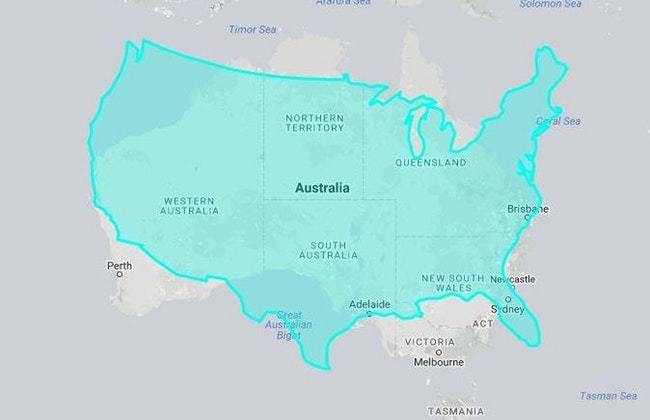
Australia Vs. The US