


These maps can show you many of the differences and groups out there. Plus, you can get a better estimate of how big your country truly is. The maps offer a totally different viewpoint for the red, white, and blue. Let’s get started!
Surprising Total Population
The areas on the map that are highlighted in red indicate places that have a total population that’s greater than the rest of the country combined, which is shown in gray. It’s crazy to think that more people are crammed into these red areas than elsewhere!
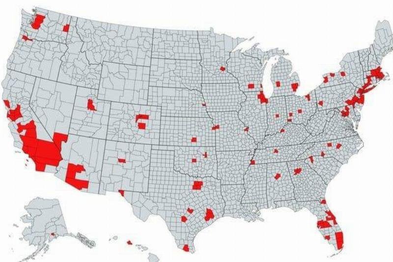
Surprising Total Population
Mongolian Empire, 1279
Most people feel that the US is the center of the universe, but you must remember history. The region shown in orange was the full reach for the Mongolian Empire back in 1279. It spans a total landmass that’s larger than the United States!
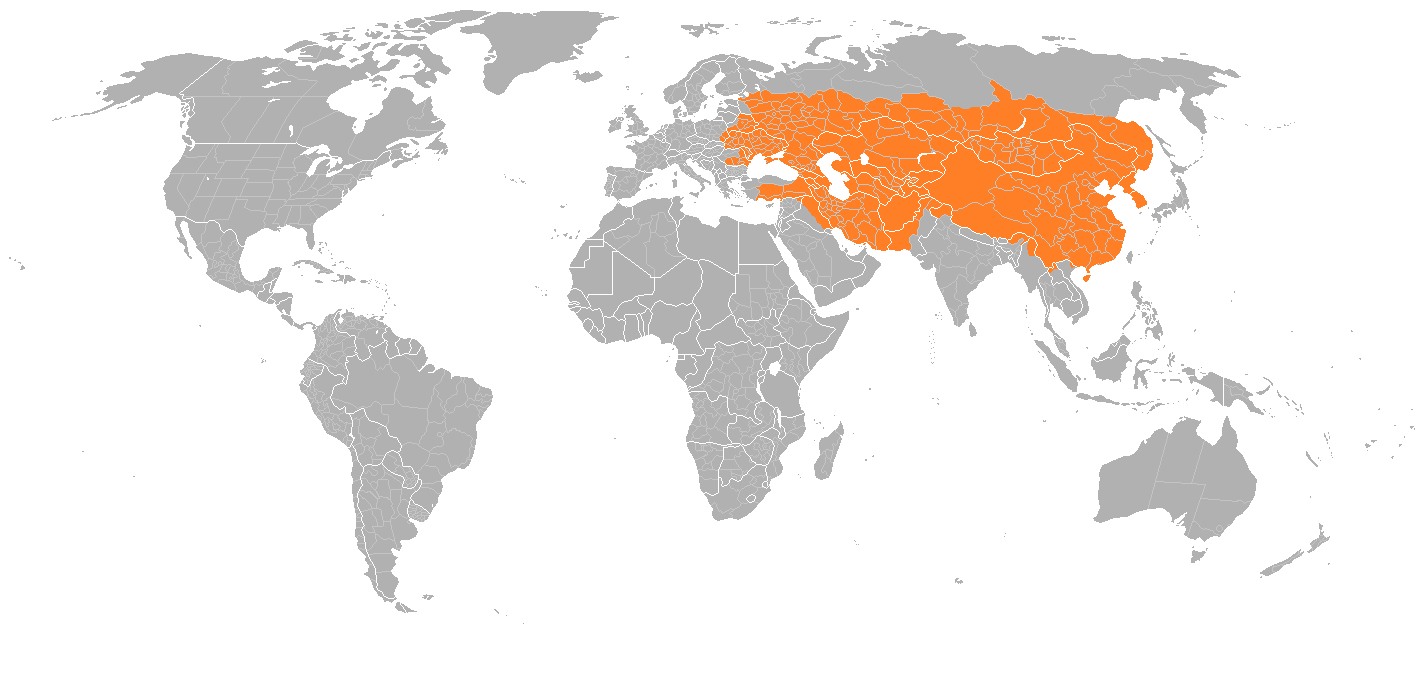
Mongolian Empire, 1279
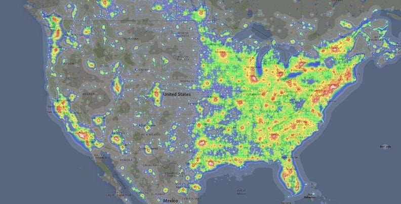
See the Sound
This map is interesting because it offers a visual representation of the loudness of certain areas in the country. The white-yellow colors mean those places are louder, with the blue/dark blue areas being quieter. Though it might not be surprising, it’s cool to see that visual.
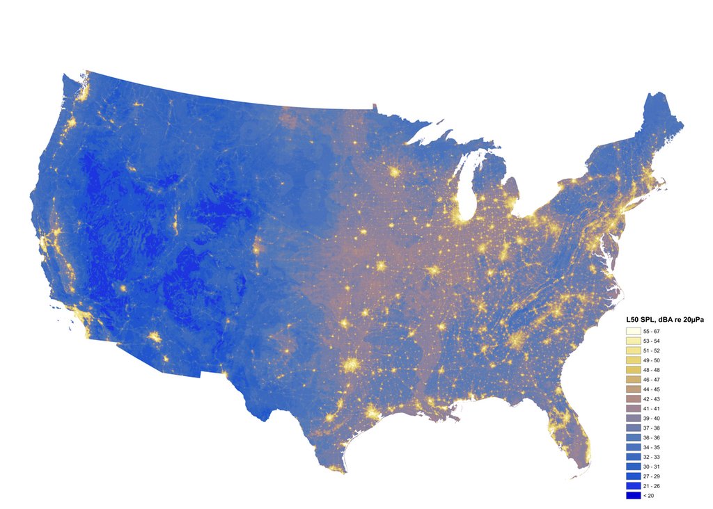
See The Sound
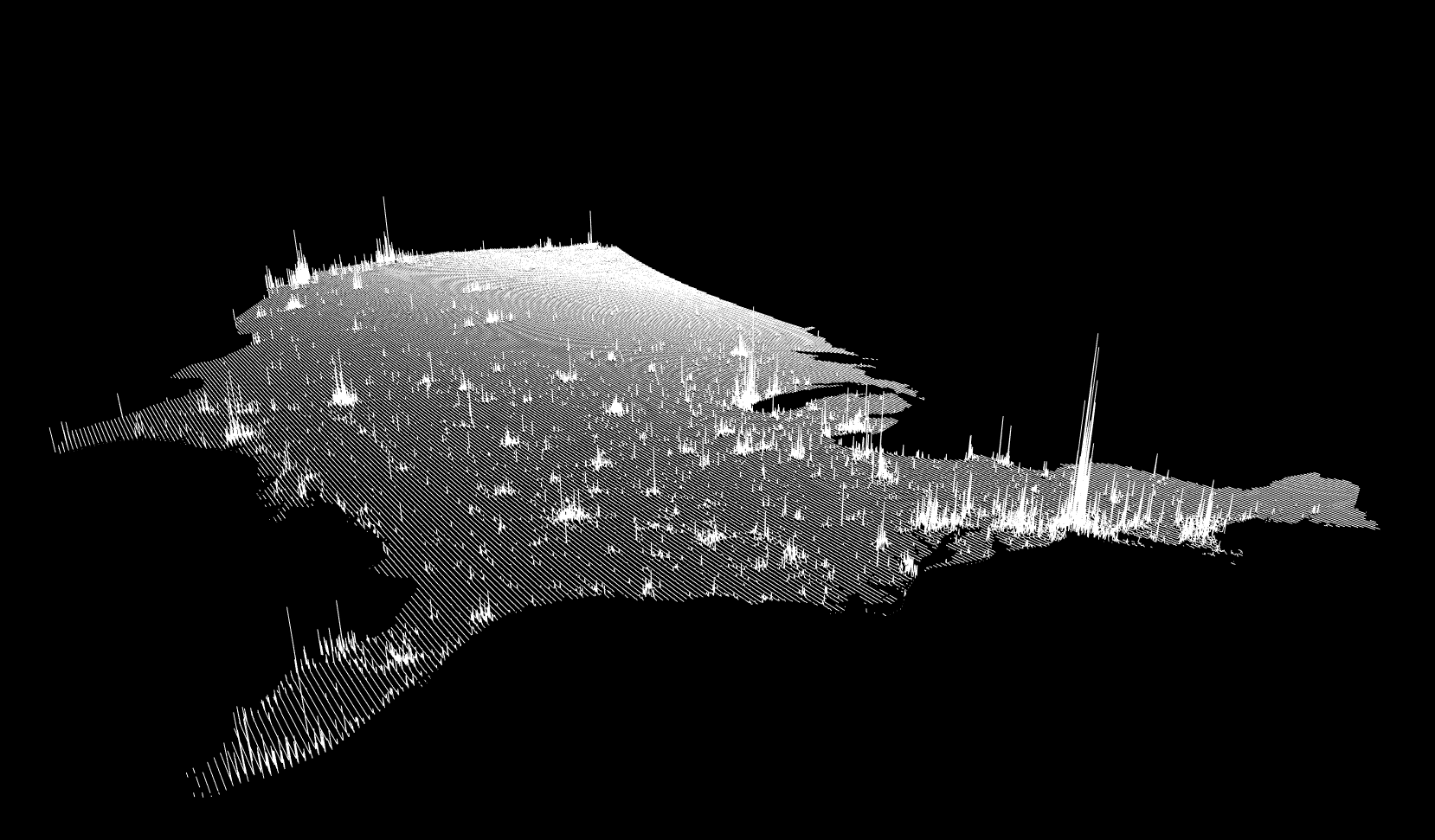
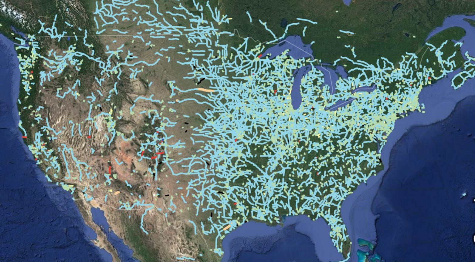
8 Million Miles of Highway
The highways in the United States make up 8 million miles total. That’s a lot of paving! In this picture, you see how interconnected they really are. Does it make you want to take a road trip?!
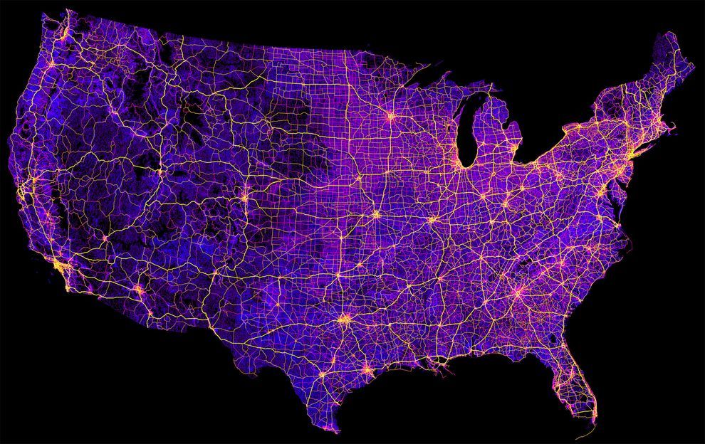
8 Million Miles Of Highway
Light Pollution
Light pollution happens when there’s too much artificial light, making the natural night sky get drowned out. Here, you get a visual representation of light pollution. More populated areas have more, as does the south.
Light Pollution
Population Spikes
It’s interesting to see how the numbers change, and there’s a trend of increased populations throughout the world. This map shows the increase for the United States. Overall, the east coast contributes much to this.
Population Spikes
No Metric System
The measurement system for the United States is the Imperial system, which comes from when it was part of the British colonies. Most other countries don’t use it, and this map shows the visual representation of the places that do.
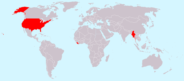
No Metric System
Tree Cover
Everyone knows that the forests and trees should be protected, but how much of the US is made of trees? This map indicates the actual land that’s covered in forests. While it looks like a lot, conservation efforts are crucial to ensure that they don’t die.
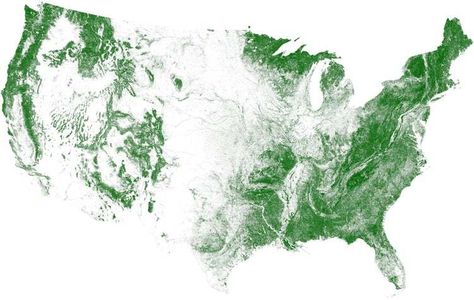
Tree Cover
Visit Every Springfield
Have you noticed that many states in the US have a Springfield city? Somebody was very clever to make a map to indicate an efficient way to hit each Springfield. That looks pretty fun and exciting!
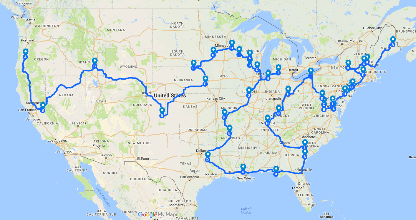
Visit Every Springfield
Out of Service Railways
The US isn’t known for its railways and public transportation. It’s a shame because it’s nice not to need a vehicle. Regardless, railways were more popular before the automobile came into play. This map shows the defunct railways throughout the country!
Out Of Service Railways
Air Traffic Control Zones
Air travel is a great thing about living in the present times. Many centuries ago, people only dreamed of flying from place to place, but now we have Wi-Fi aboard the airplanes. Here’s a map showing air traffic control zones over the US.
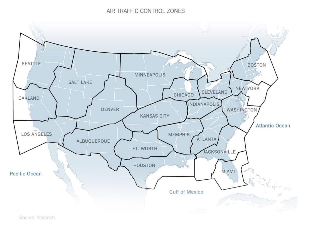
Air Traffic Conrol Zones
States Resized Based on Population Density
People often forget how vast the United States actually is because they look at states individually. With this map, you can see each state resized based on its population density. That explains the electoral vote distribution, too.
States Resized Based On Population Density
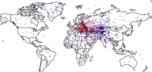
Red and Orange for Equal Populations
The population method in the United States is fascinating. People often gravitate toward the east and west coasts and cram themselves into small areas with high populations. In this photo, you can see those small orange slivers are equal to the population marked in red.
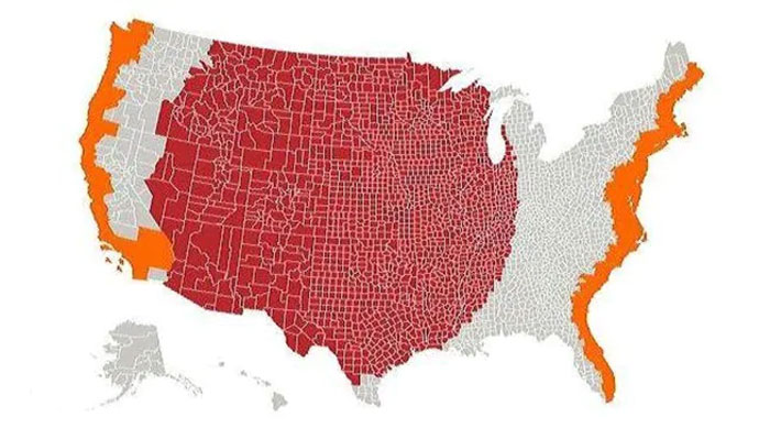
Red And Orange For Equal Populations
Australia vs. the US
In the US, you don’t usually think about other countries unless you’re planning a vacation. Who ponders the size of Australia? This map superimposes the United States over Australia to show how big it is. They’re pretty similar in size!
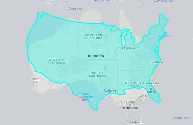
Australia Vs. The US
Dang in the US
People in different areas of the US use various phrases, and that’s primarily reflected in the slang used. For instance, this map shows how common “dang” is throughout the country. Red is the most used, and blue is the least.
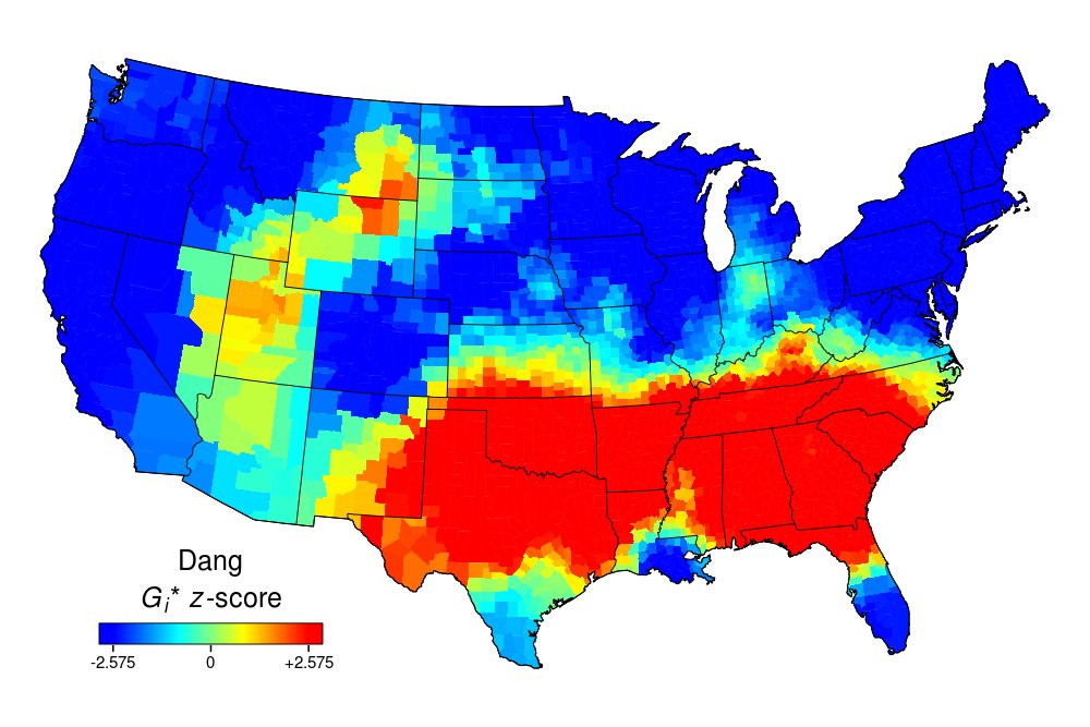
Dang In The US
Popular Coffee Shop Chains – Number of Locations
The map below shows that America likes Starbucks more than Dunkin’ Donuts, except for Florida, the Carolinas, and New England. They still prefer Dunkin. Plus, you can’t forget Minnesota, which is the only state that likes Caribou Coffee.
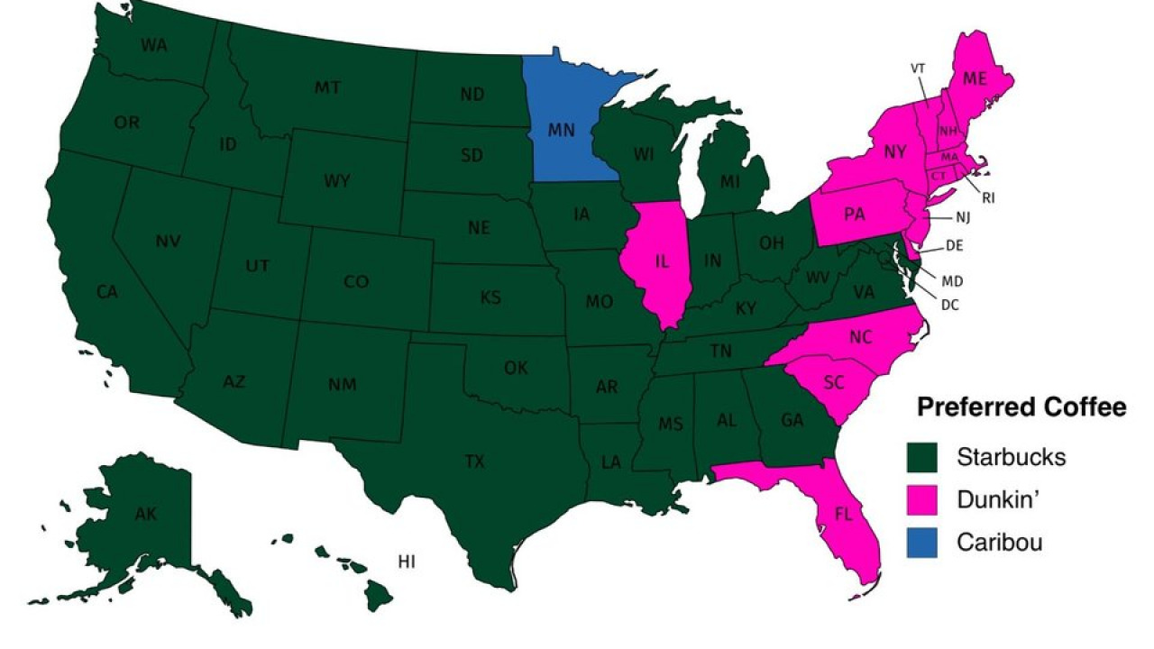
Popular Coffee Shop Chains Number Of Locations
The Top States Literally
Some maps show facts that are pretty hard to see, but others state the obvious. Here, you can see the top states of the United States, and that’s literal. You can’t argue with the facts. Hopefully, they like Canada because they’re pretty close to it!
The Top States Literally
Underwater Cables for the Internet
Did you know that the Internet is powered from underwater cables around the globe? It’s quite fascinating to see it all visually, too. Though it seems like a miracle, it’s more about impressive engineering to make it happen.
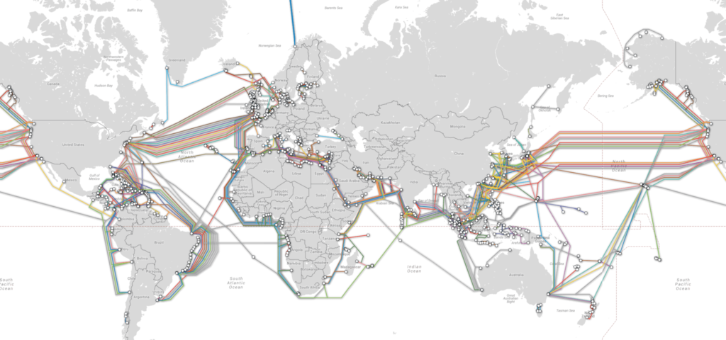
Underwater Cables For The Internet
Google Street View Covers These Areas
Google Street View is popular for letting people see the world on the Internet. How much does it actually cover? This map indicates that most of the world is covered by that program, but it still has many more places to chart, too!
Google Street View Covers These Areas
Railway Networks around the Globe (20
Though railway systems are present in the United States, they’re often used for cargo. In Europe, people rely on the railways for most of their travels. This map indicates the railway networks from around the world.
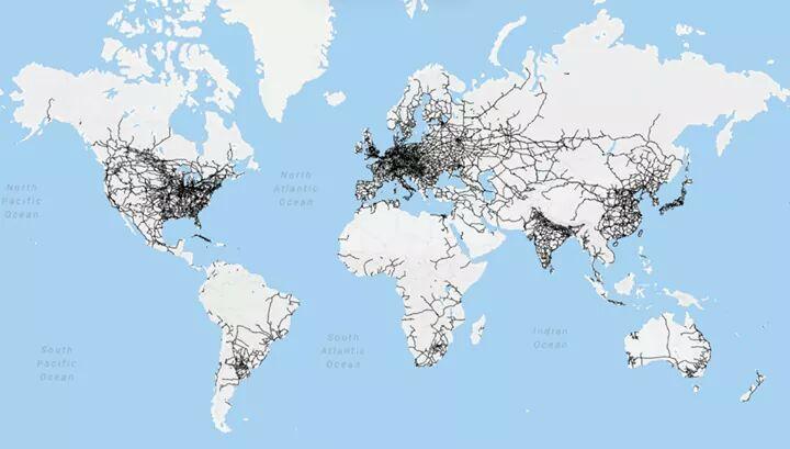
Railway Networks Around The Globe
Counties with a Gross Domestic Product of More than $100 Billion
The US is known as a world superpower, and that’s because of many wealthy individuals and companies. Where are those people found? This map indicates the counties throughout the country with a GDP of more than $100 billion. That’s not too shabby!
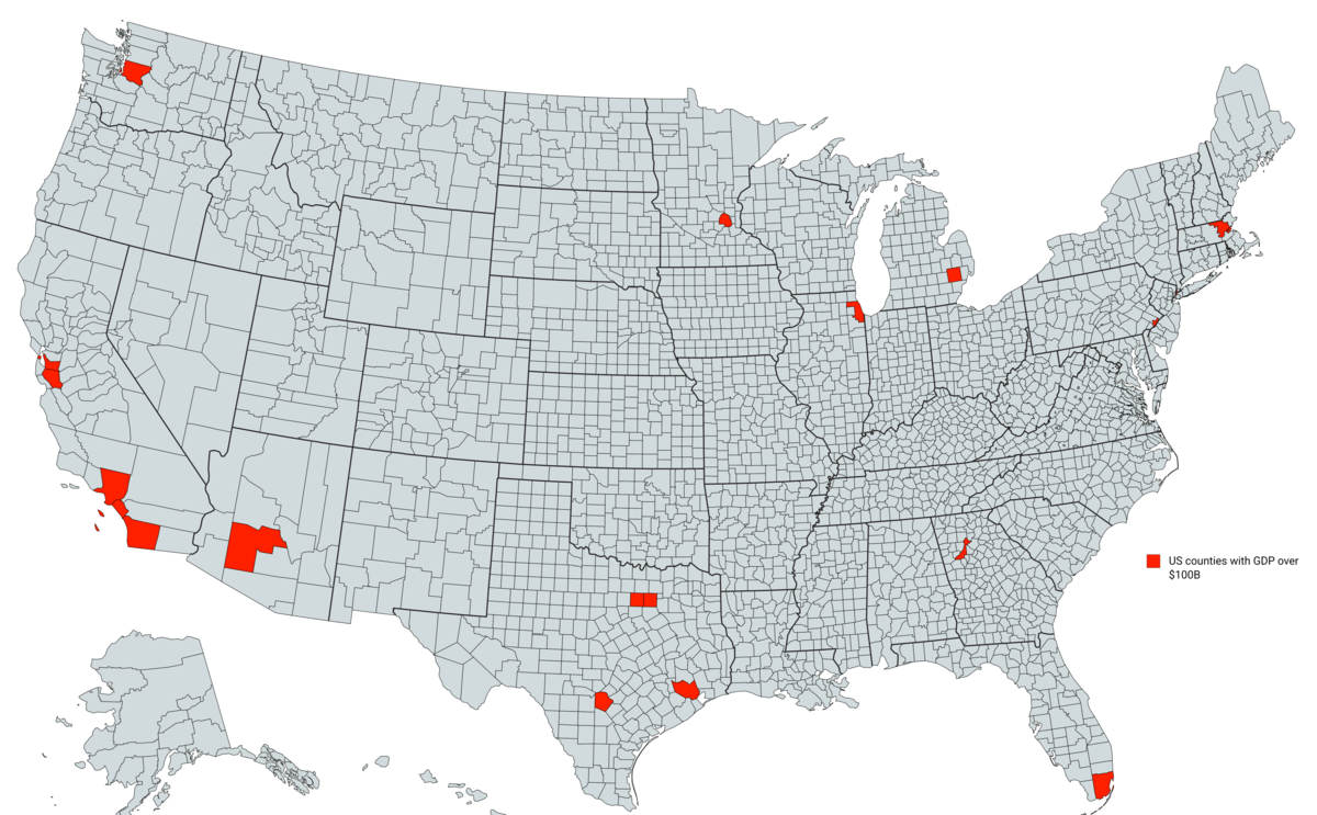
Counties With A Gross Domestic Product Of More Than $100 Billion
Illustrated Land Use
Another great way to think of how the US is divided is by its actual land usage. This map indicates how each area of land is used and how. Who knew that most of the country was made up of cow pastures?!
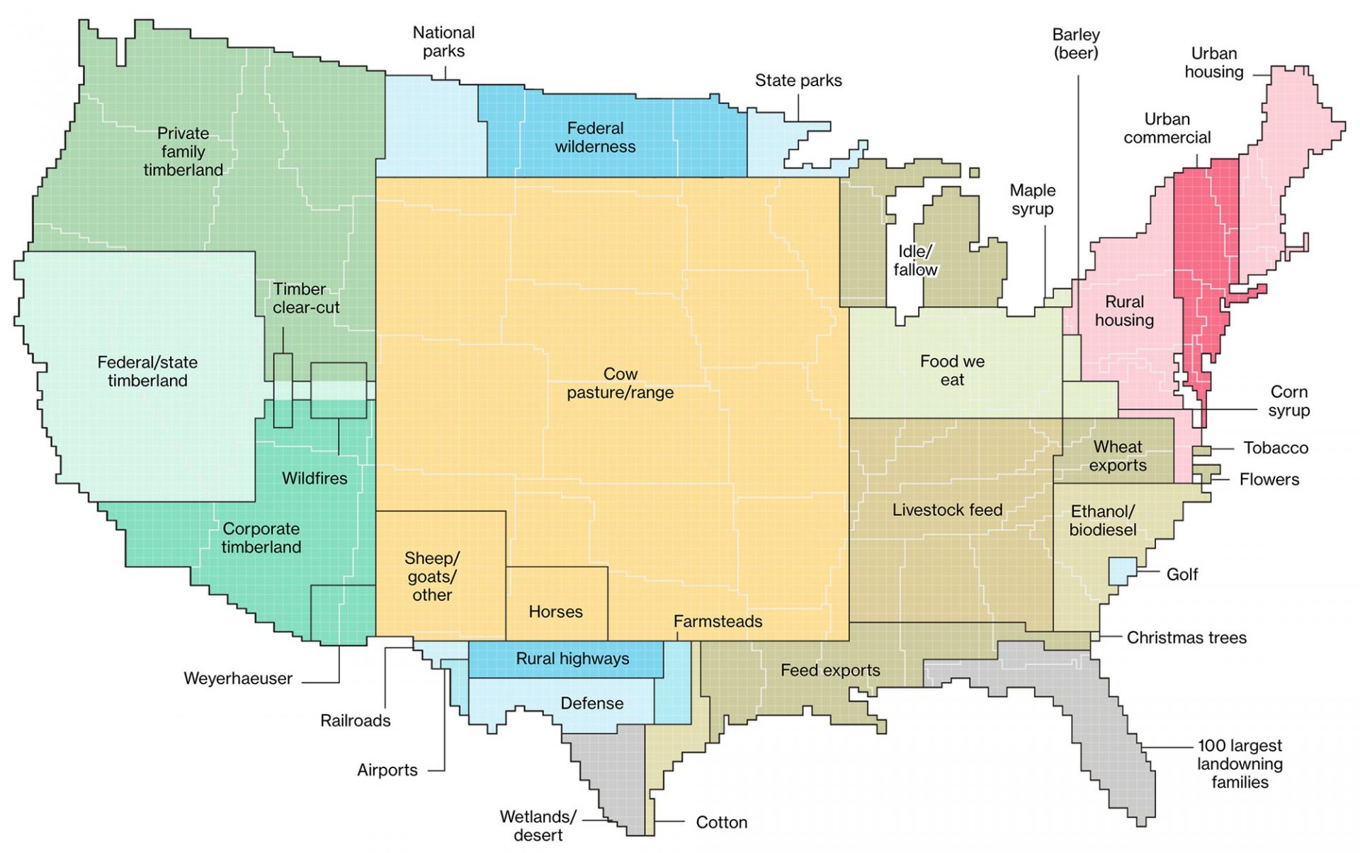
Illustrated Land Use
Finding Flamingos in Nature
Everyone loves to see flamingos with their pink feathers. Where can you find them around the world? This map indicates the areas where flamingos are found naturally. If you don’t want to travel that much, you might find some at a local zoo!
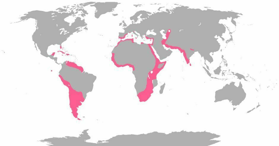
Finding Flamingos In Nature
Montana in Mongolia
Though Montana is a large state, it’s hard to understand how it compares to other areas. Here, you can see that Montana actually fits into Mongolia with more space to spare. It’s great to have that perspective!
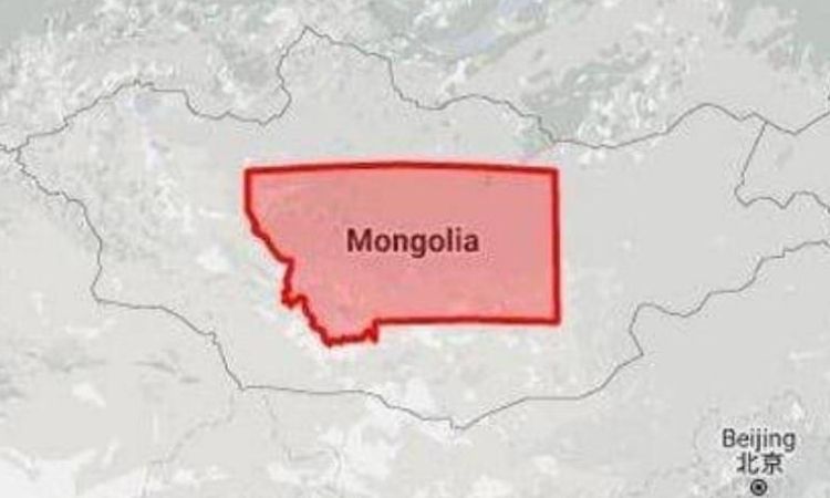
Montana In Mongolia
Peninsula vs. Peninsula
Most people don’t know that Italy and Florida are peninsulas. That means both places get surrounded by water on most of the borders but are connected to the mainland, too. Which one is better? That’s for you to decide!
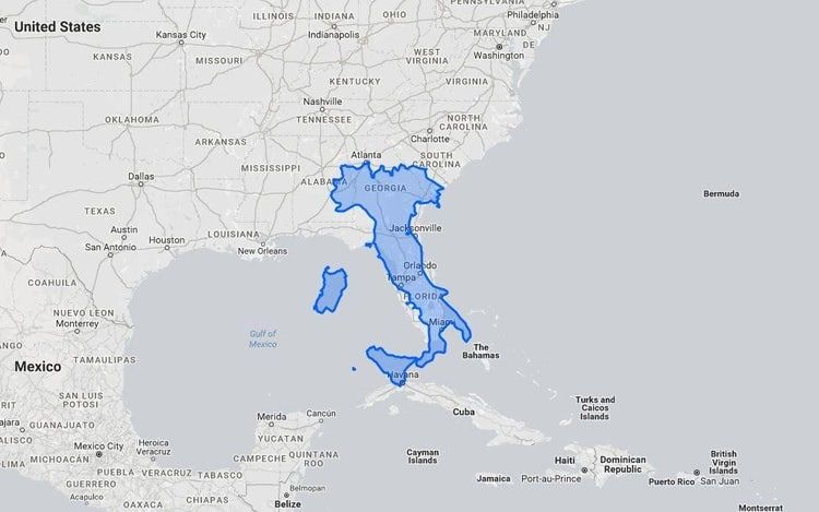
Peninsula Vs. Peninsula
Nevada in Iran
How big is Nevada? It’s home to Las Vegas, so it feels like it’s really large. However, you can see on the map below that it’s not comparable in size to Iran. Still, many other countries are smaller than it, such as Israel and Jordan.
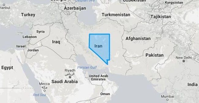
Nevada In Iran
California vs. Italy
California is a huge state that could actually be its own country. That’s part of the reason it gets 55 electoral votes. However, when superimposed on Italy’s map, you can see it’s wider but the same length.
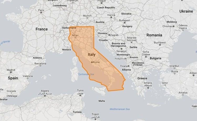
California Vs. Italy
Blue States Mean Smaller Populations than LA County
This might be shocking to some, but each state shown in blue has a combined population smaller than that of Los Angeles County alone. That is quite wild, but it’s completely true!
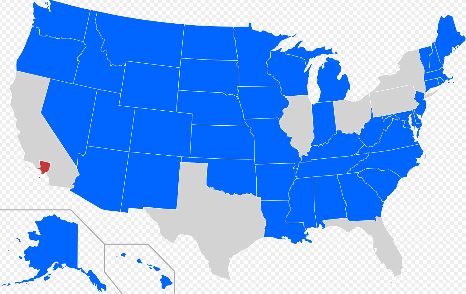
Blue States Mean Smaller Populations Than LA County
Locate Ukraine – 2,066 Americans Fail
Over 2,000 Americans were asked to indicate where Ukraine is on a map, and the below picture is the result. Some people were confused and thought it was in the US, while many others thought it was actually in Africa. Maybe they should have paid attention in Geography class!
Locate Ukraine 2,066 Americans Fail
Worldwide Super Bowl Champions
Americans love football (the pig-skin ball, that is.) This map shows a visual representation of the countries that have won the Super Bowl. Surprisingly, it’s just the United States because it’s the only one involved!
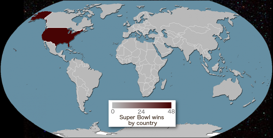
Worldwide Super Bowl Champions
New Zealand and the Midwest
You know that Australia is quite large, but what about New Zealand? Most Americans think they’re the same place, but they’re actually separate and different sizes. Here’s the comparison of New Zealand in the United States.
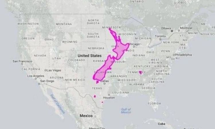
New Zealand And The Midwest
The Trick for Locating Kentucky
Kentucky is known for the restaurant chain KFC. Do you find it hard to locate it on the map? The illustration below shows a chef holding fried chicken to help. In the picture, Kentucky is the iconic fried chicken!
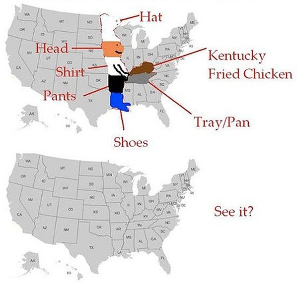
The Trick For Locating Kentucky
South America vs. Greenland
It’s hard to think about how large the land masses are. That’s why it’s great to compare them to make sense of it all. The picture below shows Greenland next to South America. Brazil is huge by contrast!
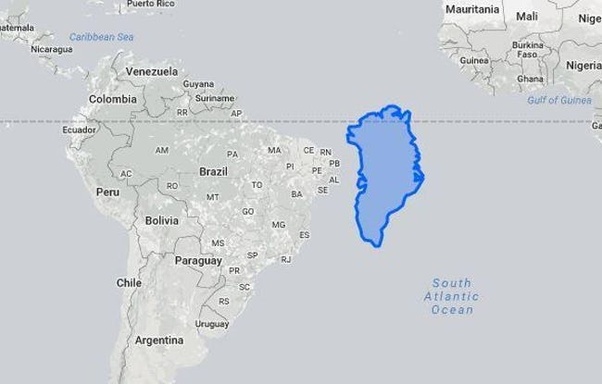
South America Vs. Greenland
Texas in Africa
While the saying is that things are bigger in Texas, that’s mainly when compared to the United States. It’s actually smaller than African countries. The map below indicates how small it really is!
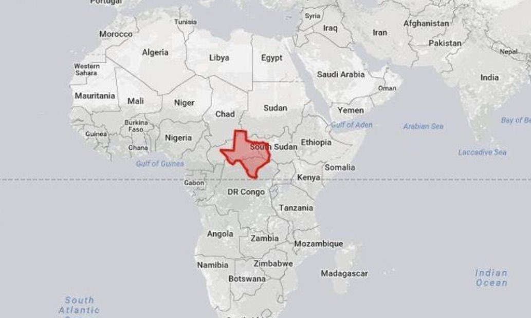
Texas In Africa
Shipping Log Lines from 1945
Shipping is a huge industry throughout the world, and it has been for decades. Below, you can get the visual representation of shipping lines from around the globe back in 1945. They truly are interconnected!
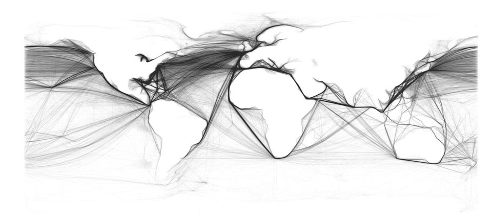
Shipping Log Lines From 1945
United States. vs. India
India actually has a large population, with about 1.33 billion people living in it. The United States has about 328.2 million, and it’s much bigger than India as a whole. That’s quite crazy when you think about it!
United States. Vs. India
United States vs. China
China is the most populous country in the world, with about 1.39 billion people. However, China is actually as large as the United States. The shocker is that China has a population about three times the size of the United States and is about the same size.
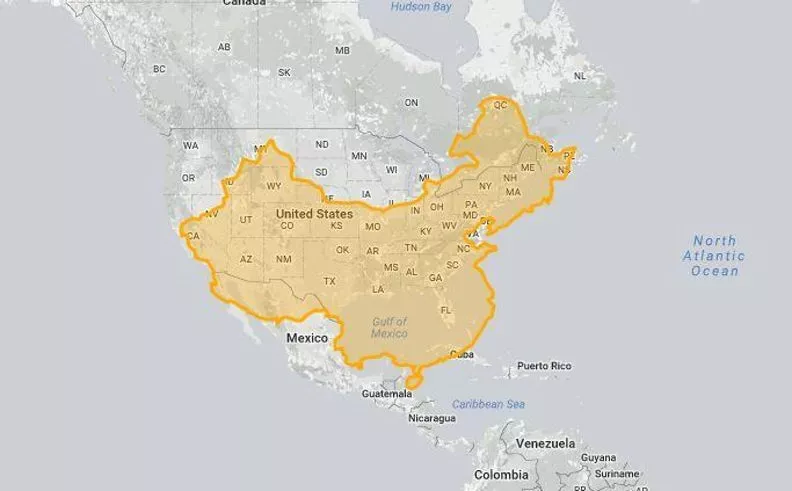
United States Vs. China
Africa Is Massive
Most people don’t know how big the continent of Africa is. You know that the US is huge, but when you look at the map, you see that the United States fits into Africa. There’s just no comparison here. It’s three times bigger than the US.
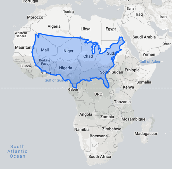
Africa Is Massive
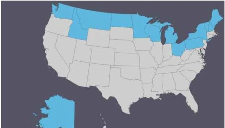
Regions Not Officially Celebrating Columbus Day
Some people feel that Christopher Columbus isn’t someone to celebrate, so Columbus Day is controversial. Many areas in the country celebrate Indigenous People’s Day instead. Here, you can see where that’s official (the yellow states).
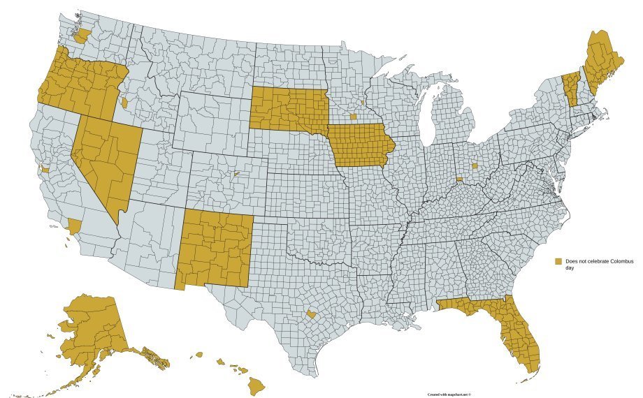
Regions Not Officially Celebrating Columbus Day
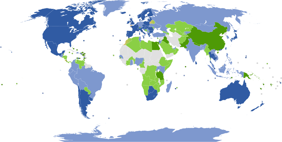
Countries Executing People Between 2015 and 2016
While it’s a grim one, you might want to know which countries executed people between 2015 and 2016. The map below indicates them. Sometimes, the executions were justified, but there were also places where it was done unfairly.
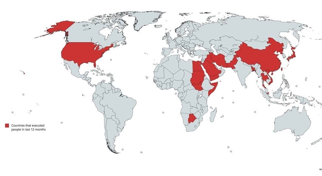
Countries Executing People Between 2015 And 2016